Take Back Monday.

Purple to pink gradient background

We help publishers aggregate & normalize
their ad revenue and campaign data into a single source of truth.

Abstract colorful gradient sphere with sparkly edge
The word "Burt." in white text on a black background.
Data flow diagram with logos of IAS, Meta, Xandr, Magnite, Salesforce, Google on the left, converging to "B" in the center, and leading to Snowflake, PowerPoint, Google BigQuery, Excel on the right.

Discrepancy Management, Pacing, & Billing

Analyze performance, campaign pacing, and revenue-at-risk. Reconcile 3p:1p delivery data and discover critical insights before they lead to billing discrepancies and client dissatisfaction.

Dashboard displaying campaign performance metrics, including impressions, viewable rate, and clicks, with graphs for impressions and CTR, device distribution, and performance by site.

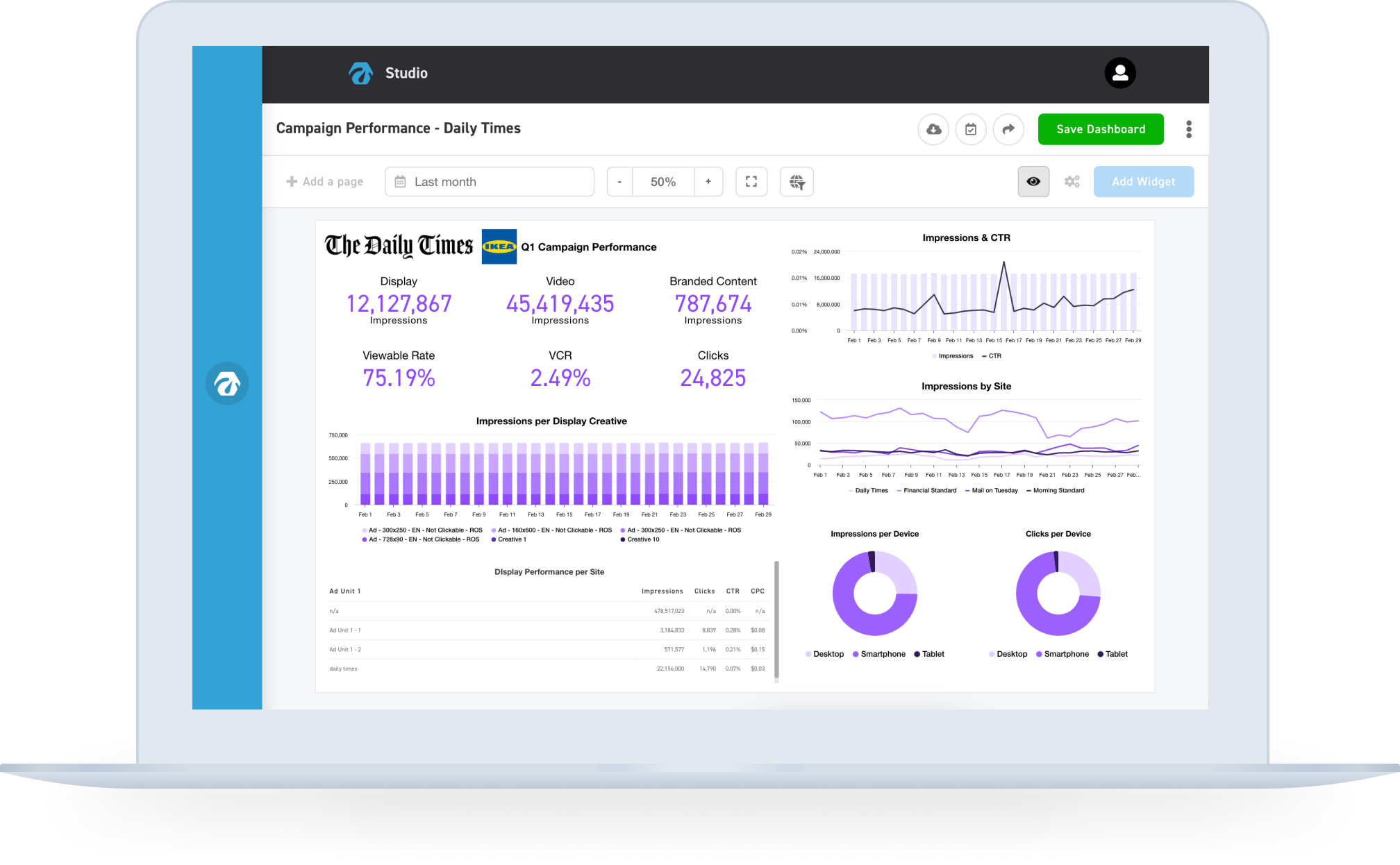
Client-Facing Reporting

Automate client end-of-month or end-of-campaign data report creation. Create pixel-perfect slide decks with the push of a button.

Laptop screen displaying a client-facing reporting dashboard with graphs and settings. The main graph shows "Campaign | Revenue From Social Media Channels" with icons representing different media channels. The sidebar includes a slide list and settings options like date range, metrics, and color themes.

Inventory Forecasting &
Yield Management

Forecast available inventory and audience to avoid overbooking and under-delivery. Get revenue, delivery & CPM analytics, and recommendations on increasing revenue and improving sales performance.

Status and forecast delivery chart showing two statuses: one with 153K delivered and 802K under-delivered, forecasted at 14% delivery; the other with 145K delivered and 22K under-delivered, forecasted at 100% delivery.

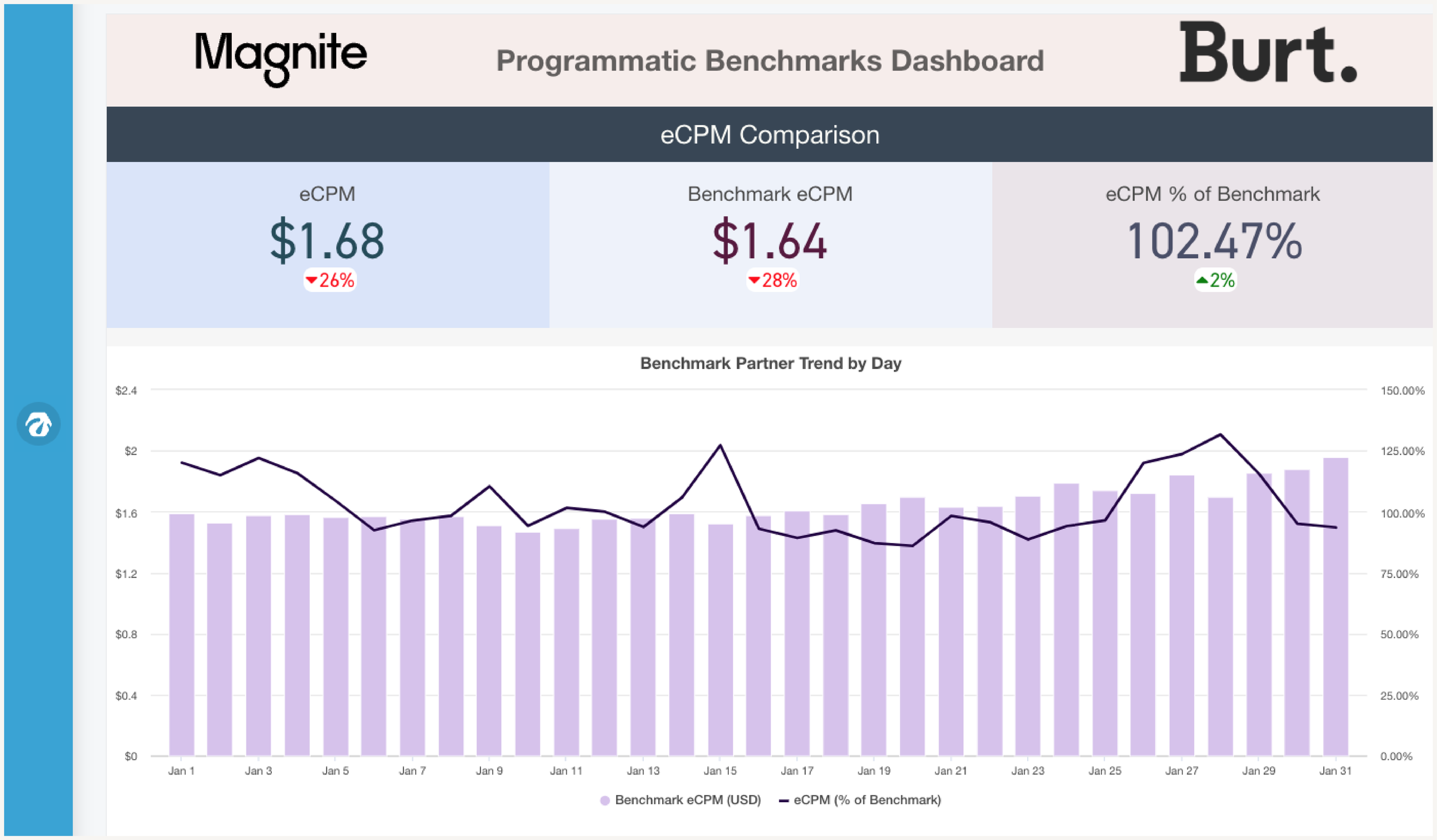
Industry Benchmarking

Contextualize your performance so that you can identify opportunities. Compare your eCPM across advertisers and ad & device types with direct and programmatic benchmarks.

Dashboard displaying eCPM comparison, benchmark eCPM, and eCPM percentage of benchmark with a line and bar graph showing trends over several days in January.

Smart Alerting

Customized alerts and notifications that are delivered to your inbox for direct and programmatic campaigns. Tailored for individuals managing campaigns, team leads, site teams, and management.

Blurred infographic showing eCPM graph and pie chart labeled "Top Buyer by Partner."
Abstract image with a wavy line and the text "Detected Deviation."

Sales Intelligence

Find revenue opportunities hiding in your data. Uncover high-intent advertisers, reclaim lapsed deals, and prioritize outreach with confidence. No guesswork required.

Stylized stick figure holding a star with a French phrase about sleeping.

And more…

Reach Out Now

🟣 Burt Leads new beta offer: Sign up in May and get an extended free trial!